
 About Us
 Benefits
 Outsourcing Process
 Quality Outsourcing
 Software Developement
 Web Developement
 Mobile Applications
 Design Services
 Digital Marketing
 Business Processes
 engineering Services
 Knowledge Services

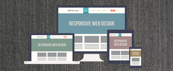
Essential Responsive Design Techniques
Technology changing this beautiful world rapidly. Consumption of smart devices also increased in last few years. Recently every one owns one or another smart device and this make a difference in web design techniques also. Responsive web design becomes essential rather then a feature.
More than three adults in every ten is using smart device. With this internet ready smart devices world is on finger tips of all. Due to high demand of smart device ready website todays web designer and web developer continues to innovate so that website runs best on all these smart devices.
Implementing new web design techniques and refining old web design techniques is must. In process of that rise of responsive web design happens. Now a day’s responsive web design has been applied in all most all websites. But some time desired results of responsive web design are not achieved.
Why results not achieved is a big question with several answer. One of them is hiring of a web design company to achieve responsive web design. Hire best web design company to get a desired responsive web design always. As good web design company always take care of essential responsive web design techniques while designing or redesigning a website.
What Are The Essential Responsive Web Design Techniques?
There are many other responsive web design techniques are available but few of them must be taken care while designing a website. Let’s discuss most important five responsive web design techniques.
Scalable Vector Images
It is a very helpful technique in displaying image as scalable vector images gives flexibility to resize images without affecting quality. Smart devices facilitate users to zoom in and out with ease and this require to set display of images according to that, so maintaining a quality of image is essential regardless of display size.
To achieve good scalable images, remove height and width attributes of images and apply it automatically on images. However, for progressively enhanced logos and icons leave attributes as it is. This permits to size them to the closest logical touch size. Using CSS to edit them later is a good choice.
CSS Sprites
Page loading time is vital for better display and even for search engine as per latest trends. One of the most effective way to reduce page load time is reduce requests and this could be achieved with the help of CSS sprites. How to use CSS sprites? Don’t waste time combine all common images and small images and serve to one site across the multiple platform.
Take a note that CSS sprites don’t scale without external assistance so use of CSS 3 is increasing. As now there are many CSS 3 background-size property compatible browsers are existing.
Think Mobile First
Scaling form the desktop website to mobile device is recognized old fashioned technique not because this technique is really old but now a days “Mobile First” strategy is more popular. “Mobile First” is more about philosophy and approach rather then specific method.
Experts in interactive website design services are design mobile specific web design for great mobile experience and enhance the advantage of responsiveness with desktop computers, laptop other other smart devices. Mobile first web design technique becomes forward looking within the short span of time. We don’t know how digital age of tomorrow looks but it is sure that it will be influenced by Mobile.
The Grid
Grid system allows to be a clean and consistent. It maintains proper balance between the design elements and work. However, if grid system is flexible it enhances the edge of website and allow to create a page in different layout easily specially when it comes to adopt immediate needs. Grid system also facilitates to emphasize most vital contents and attributes and narrow focus to reduce distractions.
Graceful Degradation
Enjoyable browsing experience is must and remember everyone is not using latest browsers. Graceful degradation allows users to access website easily without updating browser immediately. There are plenty of website users prefer to leave the website then to upgrade a web browser. So, graceful degradation helps website to owner to keep every one happy. Web design and development companies like Falcon Online Services utilizing these kinds of techniques to make website more user-friendly and graceful degradation is one of them
Conclusion
Staying ahead of the curve and competitors is a hard work but these techniques make it smart. This is a reason why these techniques become the essential responsive website design techniques. If you need a detailed consultation on key responsive website design techniques or need to design website compatible to tomorrows trend, experts at our company would surly help you. You just need to contact us with the details and we will get back to you with detailed plan for existing or new website design.